





| Case Study
We thrive on stretching the boundaries when it comes to what we offer our clients, the combination of the two guidelines from Ferrero and Bestway to manufacture the aisle end tower display is an example of this. Once consensus was agreed, we constructed a tower here at Boyall Graphics to ensure that all key parts were fitted to a tight tolerance against the framework of the tower. End results of project:
|
| Our approach to utilising brand awareness
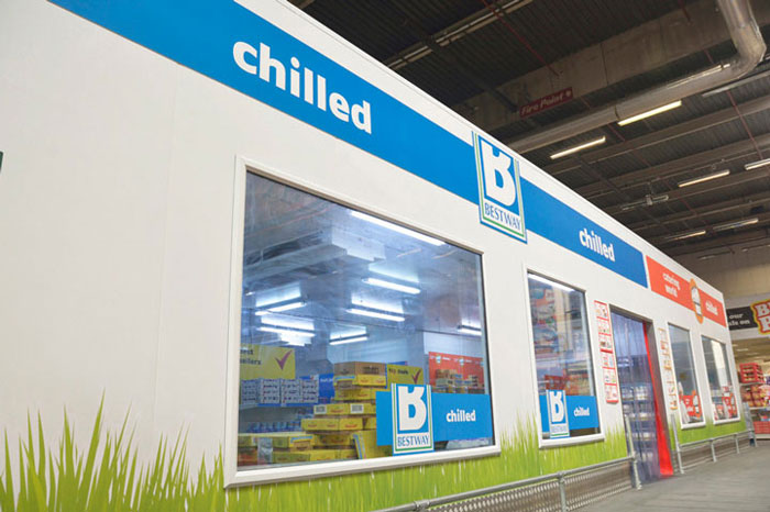
With thousands of products needing Point of Sale graphics, we have worked with brands to develop a wide range of media from simple product display slats, wobblers, bollard covers, pallet wraps and vertical aisle banners to complete branded bays and tower ends. All coming together to present a unified message to the buyer.A great starting point for such an exercise is to do a site survey of the entire depot or fleet of depots. Our site survey assists the cash and carry company to manage the brands advertising space and contract periods whilst at the same time identify what point of sale opportunities exist for brands. An example of this is the End of Aisle Tower. Each graphical area within the tower has an artwork template which is provided by us. This helps their brand collateral team to position key data / graphics on each panel and easily provides the brand control as to how their tower or media format will look.
|
A strong brand design defines the aisle with good use of aisle fins for great eye level visibility in locating your needed product quickly from either end of the aisle. |  |
Bestway Batleys has used its industry knowledge of ethnic foods from around the world and commissioned Boyall Graphics to create the World Foods brand to define an entire section. The striking yellow theme enables customers to quickly navigate and find region specific products.
How we promote brand collateral within the design
People's time is short and many thousands of products are being sold across the stores. Personalising promotions so the message is short, and simple enables foot fall to get the message before they have walked by and switched off. Using one font that's easy to read is vital along with strong primary colour's to draw attention. Within the industry the Bestway wholesale design main logo is a good example. There is one strong colour specific pantone orange and a unique but recognizable font that is pleasing to the eye. The result is that the colour becomes synonymous with the brand itself. You will be pleased to know that at Boyall graphics we spend much time with all of the big brands calibrating and approving pantone specific colours.
After developing a successful trading relationship with Peter and Partners Point of Sale Specialists for the Wholesale Cash and Carry market place, Boyall Graphics and Print acquired the interests of the company in December 2011.
Peter and Partners Boyall Graphics and Print has organically grown within the Cash and Carry sector by developing strong working relationships with blue chip companies, designing, developing and installing POS graphics across their UK based estates.
 | Left: Promotional core goal post elevates and creates attention for key offers
|


© Boyall Graphics and Print Ltd, 54-56 Tenter Rd, Moulton Park, Northampton. All rights reserved | VAT Number 581482034 | Sitemap